import tellurium as te
import matplotlib.pyplot as plt

r1 = te.loada("""
     -> P; k0 + k1*S
     P ->; k2*X*P
     -> X; k3*S
     X ->; k4*X

     k1 = 1; k2 = 1
     k3 = 1; k4 = 1

     # Set basal rate to zero
     k0 = 0; S = 1

     # Change signal, P won't change
     at time > 10: S = S*2

     # Change basal rate and set S back to what it was
     at time > 25: k0 = 0.3, S = 1;

     # Change signal, this time P will change
     at time > 40: S = S*2
""")

m = r1.simulate(0, 60, 200, ['time', 'P', 'S'])
plt.plot (m['time'], m['P'], label='P')
plt.plot (m['time'], m['S'], label='S')
plt.text(2, 0.75, "Basal = 0")
plt.text(9, 0.9, "Change S")
plt.text(14, 1.2, "P restored")
plt.text(20, 0.75, "Set basal > 0")
plt.text(35, 0.9, "Change S, P not restored")
plt.legend()
Wednesday, November 29, 2023
A simple linear pathway
Analysis of a simple pathway:
This model is model a) from the paper by Tyson et al (2003) "Sniffers, buzzers, toggles and blinkers: dynamics of regulatory and signaling pathways in the cell". I changed their R to P however so I could use the symbol R for response.
Assume $ v_1 = k_1 S $ and $ v_2 = k_2 P $
Then $\frac{dP}{dt} = k_1 S - k_2 P $. At steady-state this equals 0 so that
$$ P = \frac{k_1 S}{k_2} $$
In other words P is a linear function of S. In terms of logarithmic senstivities or the reponse coefficient:
$$ R^P_S = \frac{dP}{dS} \frac{S}{P} = \frac{k_1}{k_2} \frac{k_2}{k_1} = 1 $$
That is a 1% change in S will lead to a 1% change in the steady-state level of P. This is important because in their pathway (d, shown below) they use this property to ensure that when S also regulates a secondary pathway that in turn up regulates the consumption step v2, the level of P remains unchanged.
This property is not very robust however and any change to the rate law on $v_1$ will result in the pathway failing to maintain P constant. For example if $v_1 = k_o + k_1 S$, where we've added a basal rate of $k_o$, then the response becomes:
$$ R^P_S = = \frac{k_1 S}{k_o + k_1 S} $$
that is the response is no longer proportional. Change S in this case will result in P changing. The code below will model this system. One important point to make is that this isn't an example of integral control.
Sunday, November 12, 2023
Plotting a steady-state plot
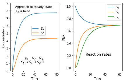
It's always surprising to find students who don't quite get what a steady-state is. Here is a simulation of a three step pathway that might help. You'll need to install tellurium for this to work.
$X_o \stackrel{v_1}{\rightarrow} S_1 \stackrel{v_2}{\rightarrow} S_2 \stackrel{v_3}{\rightarrow}$
we assume that $X_o$ is fixed and does not change in time. I don't care where $S_3$ goes.
If we start with zero concentrations for $S_1$ and $S_2$ we get the following plots. The left plot shows the change in concentration and the right plot the reaction rates. Note that all three reaction rates approach the same rate since at steady-state all rates must be equal.
import tellurium as te
import matplotlib.pyplot as plt

r = te.loada("""
    J1: $Xo -> S1; k1*Xo - k2*S1
    J2:  S1 -> S2; k3*S1 - k4*S2
    J3:  S2 -> ;   k5*S2

      k1 = 0.1; k2 = 0.04
      k3 = 0.14; k4 = 0.09
      k5 = 0.16
      Xo = 10
""")

m = r.simulate (0, 60, 100)
plt.subplot (1,2, 1)
plt.plot(m['time'], m['[S1]'], label='S1')
plt.plot(m['time'], m['[S2]'], label='S2')
plt.ylim((0, 9))
plt.xlabel('Time')
plt.ylabel('Concentration')
plt.text(5, 8.4, 'Approach to steady-state')
plt.text(5, 7.8, '$X_o$ is fixed')
plt.text(14, 1.5, r'$\quad\  v_1 \quad v_2 \quad v_3$', fontsize = 12)
plt.text(14, 1, r'$X_o \rightarrow S_1 \rightarrow S_2 \rightarrow$', fontsize = 12)
plt.legend(bbox_to_anchor=(0.4, 0.5))

# Next generate the reaction rates
r.reset()
m = r.simulate (0, 40, 100, ['time', 'J1', 'J2', 'J3'])
plt.subplot (1,2, 2)
plt.plot(m['time'], m['J1'], label='$v_1$')
plt.plot(m['time'], m['J2'], label='$v_2$')
plt.plot(m['time'], m['J3'], label='$v_3$')
plt.xlabel('Time')
plt.ylabel('Flux')
plt.text(14, 0.2, r'Reaction rates', fontsize = 12)
plt.legend()
plt.tight_layout()
plt.show()
Subscribe to:
Comments (Atom)


