August 6, 2016 11:43 am
I've been looking for a textbook on statistics for a class I'll teach in the autumn term. While the content of many textbooks might be ok the way the information is presented makes them difficult to read - at least it does for me. This applies to most undergraduate textbooks published today whether they be about statistics or other topics. There seems to be a need by publishers to embellish textbooks with so much stylistic sugar that the content is buried.
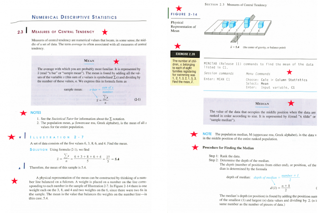
I scanned two typical pages from a second-hand stats textbook I bought from Goodwill to illustrate what I mean.
I've marked using a red star the many different styles used in the textbook on two random pages, these include:
1. Section heading with a vertical dark purple line
2. Highlighted area using three colors (black, blue and purple)
3. A notes section with blue heading
4. An Illustration section using blue font but spaced out letters and thin left-bar in dark purple
4. Up and down purple arrows in the illustration section indicating question and answer
6. Paragraph of text using back font (finally something normal)
7. Figure caption in dark purple text with green vertical line and horizonal line in black
8. Exercise box in the margin with heading in white with black background
9. Exercise box where the question in black with yellow background
10. Typewriter font for computer code with black and blue horizontal lines delimiting code
Not included in these pages are also other stylistic sugar:
1. Case study section that uses five colors and six stylistic features
2. Exercises with six stylistic features including at least eleven different symbols
3. Call-out in exercises using a script font with blue background.
3. Chapter practice tests in black font with blue background and thick blue horizontal line
4. Chapter Objective in black font, red bullet point in off yellow background with a vertical dotted line.
5. Chapter heading page, eight stylistic features with multiple fonts
And this is before a student has even started to read the content I counted at least 15 different fonts used in the text.
