October 20, 2017 10:31 am
I had a model with 27 floating species and I wanted to plot the steady-state concentrations on a histogram where the labels were the names of the different species. Here is a general-purpose script that will do that:
def plotFloatingSpecies (r, width=12, height=6):
    import matplotlib.pyplot as plt
    xlabels = r.getFloatingSpeciesIds()
    concs = r.getFloatingSpeciesConcentrations()
    plt.figure(figsize=(width,height))
    plt.bar(xlabels, concs, label=xlabels)
    plt.xticks(range (len (xlabels)), xlabels, ha='right', rotation=45)
The function has a default width and height for the resulting plot. The default widens the usual size so that the labels don't collide. The first argument is the libroadrunner instance. To give a contrived example, the following is a model of 8 floating species that form a linear chain governed by simple irreversible mass-action kinetics.
import tellurium as te
import roadrunner

def plotFloatingSpecies (r, width=12, height=6):
    import matplotlib.pyplot as plt
    xlabels = r.getFloatingSpeciesIds()
    concs = r.getFloatingSpeciesConcentrations()
    plt.figure(figsize=(width,height))
    plt.bar(xlabels, concs, label=xlabels)
    plt.xticks(range (len (xlabels)), xlabels,  ha='right', rotation=45)

r = te.loada("""
     $Xo -> S1; k1*Xo;
      S1 -> S2;  k2*S1;
      S2 -> S3;  k3*S2;
      S3 -> S4;  k3*S3;
      S4 -> S5;  k4*S4;
      S5 -> S6;  k5*S5;
      S6 -> S7;  k4*S6;
      S7 -> S8;  k3*S7;
      S8 -> ;    k4*S8;

      k1 = 0.3; k2 = 0.5; k3 = 0.27; k4 = 0.9; k5 = 0.14
      Xo = 10;
""")

r.steadyState()
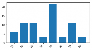
plotFloatingSpecies (r, width=6, height=3)
The resulting plot is shown below:

No comments:
Post a Comment